Predicting Automobile Price

Objective
This use case demonstrates building, evaluating and deploying a regression model in Xceed Analytics. The use case here is based on the open dataset from UCI for automobile price prediction. This sample data set consists of three types of entities: (a) the specification of an auto in terms of various characteristics, (b) its assigned insurance risk rating, (c) its normalized losses in use as compared to other cars. It also consists of the actual price of the each of the automobile type.
This demo showcases building a regression model to predict price of automobile based on its input characteristics and showcase evaluating the results of the built model using various model evaluation techniques.
Steps followed to develop and deploy the model
- Upload the data to Xceed Analytics and create a dataset
- Create the Workflow for the experiment
- Perform initial exploration of data columns.
- Perform Cleanup and Tranform operations
- Build/Train a regression Model
- Review the model output and Evaluate the model
- Improve on the metrics which will be useful for the productionizing
- Deploy/Publish the model
Upload the data to Xceed Analytcs and Create the dataset
-
Upload the automobile demo data set to Xceed Analytics fromt the Data Connections Page. For more information on Data Connections refer to Data Connectors
-
Create a dataset under data catalogue from the uploaded datasource. For more information on how to create a dataset, refer to Data Catalogue
Create a Worfklow/Experiment
- Go to the Workflows Tab on the Navigation and Create our first Regression Experiment/Workflow. For more information on how to create a workflow, refer to Create Workflow
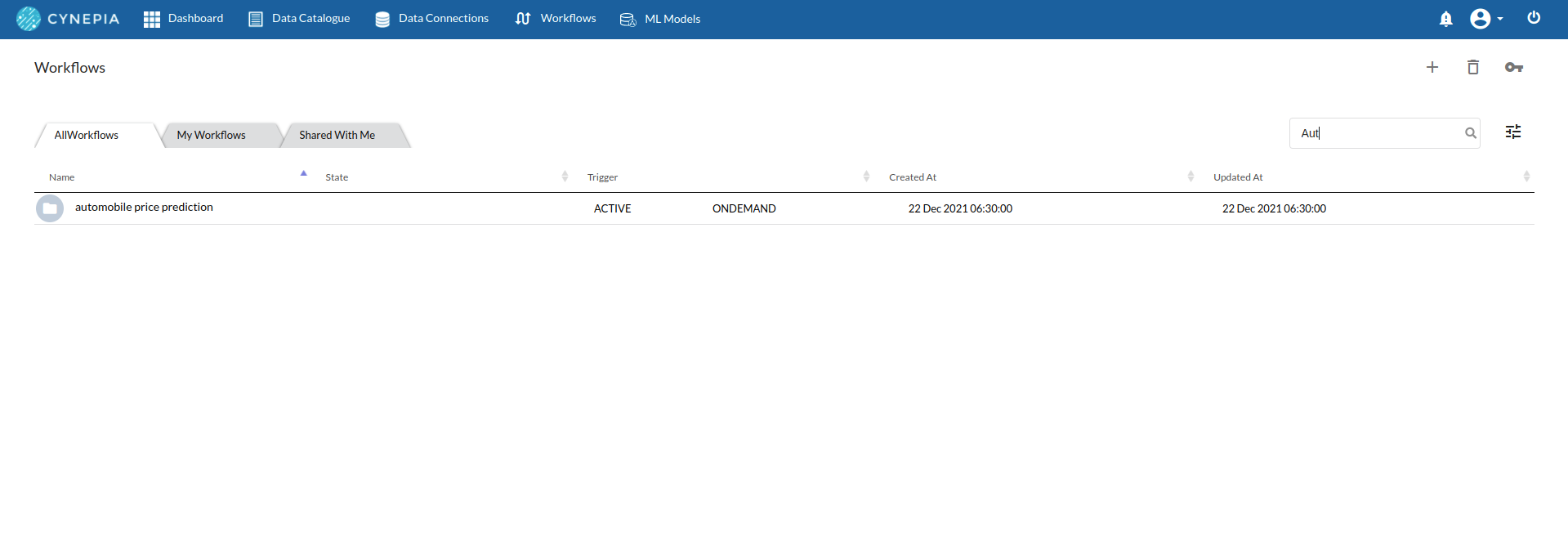
- Once the workflow is created, you will see an entry on the workflow's page listing your workflow.
-
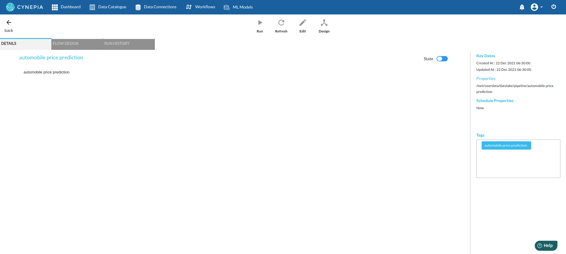
Double-Click on the Workflow List Item to go to workflow Details Page and Click Design Workflow. For more information, refer to Workflow Designer Main Page
-
Add the Input Dataset to the step view by clicking on '+'. You will see the input step added to the Step View.
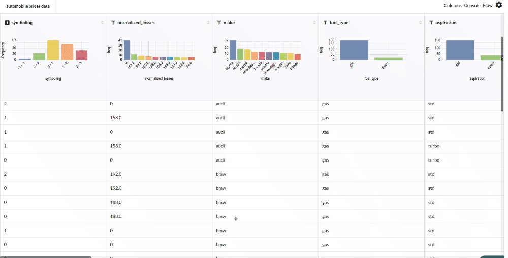
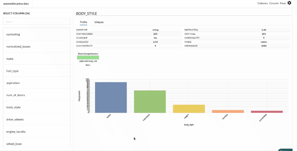
Perform Initial Exploration of the data columns
Xceed Analytics provides enables you to review dataset statistics in various ways.
- Output Table with Header Profile (Refer to Output Window, for more details)
- Column Statistics Tab (Refer to Column Statistics for more details on individual KPI)
Perform Cleanup and Transform Operations
- Notice that we need to perform a few clean up transformations before we can build our model.
- Firstly, Review column profile information for no_of_doors
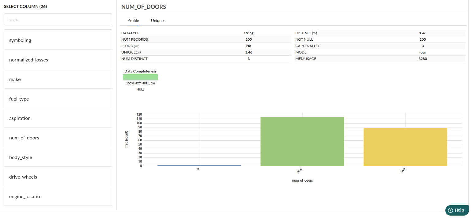
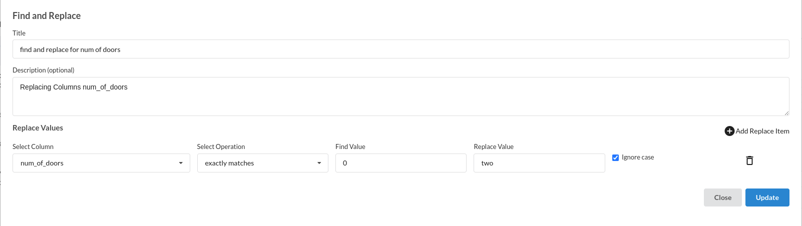
- num_of_doors column is a few cases is 0, which is not correct, we replace the same with mode of the num_of_doors as shown in the column profile. We use Find and Replace Transformer as shown below to perform the above operation
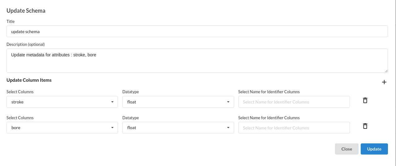
- Update the schema by changing the datatypes of stroke and bore to float instead of number. We use Update Schema
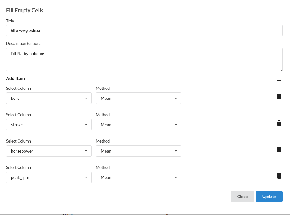
- Fill the null/empty values in various columns such as bore, stroke, horsepower and peak_rpm with mean. The processor to use for this step is fill empty values
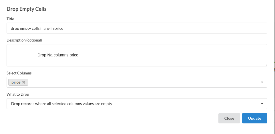
- Drop all records with no value in price column, since we intend to use price as our target column, we cannot afford to have nulls. The processor used for this step is drop empty cells
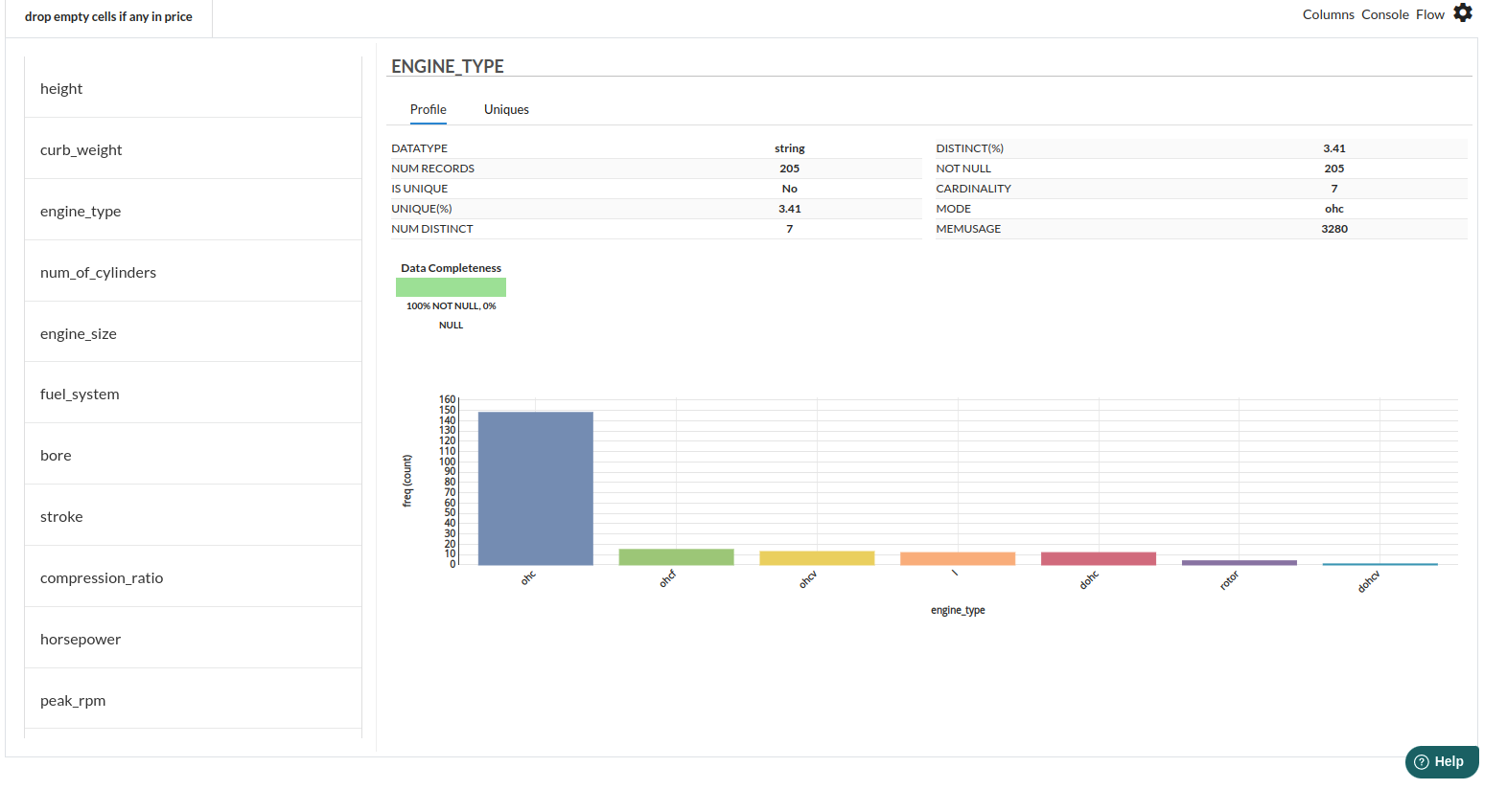
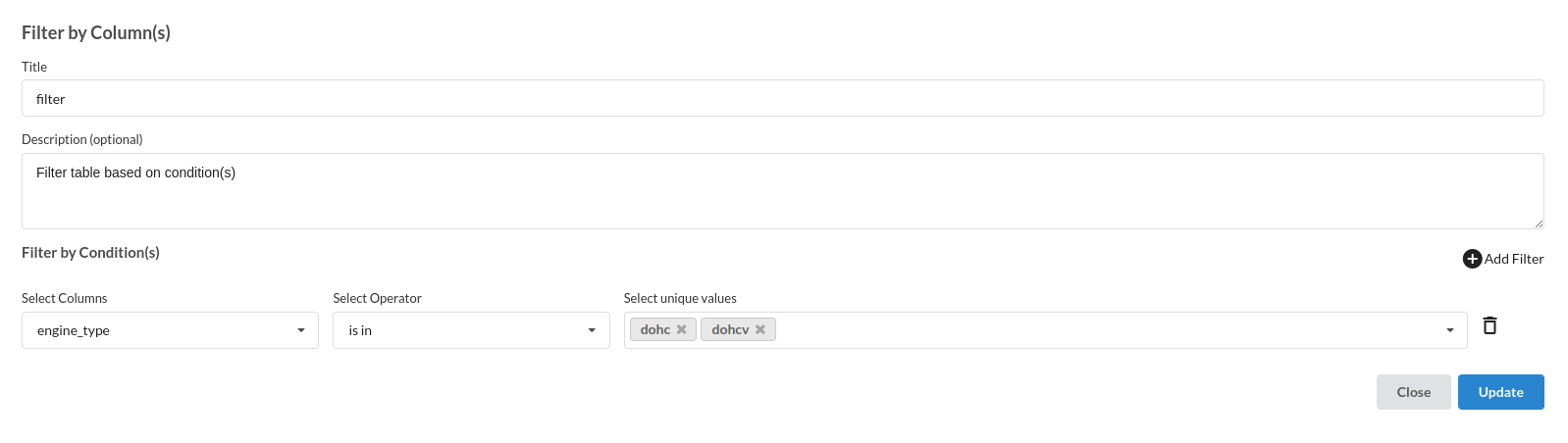
Review the engine_type and Filter the records where we don't have sufficient sample
Build/Train a regression Model
We now have a dataset on which we can build our regression model. Following are some of the steps that we perform before building a model.
- Feature Selection
- Feature Encoding
- Choose the algorithm and train the model.
Feature Selection
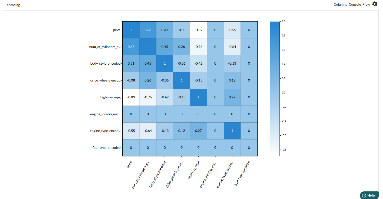
In order to manually choose the features of interest, go to the Column Profile View and Select Multi-variate profile to compute a correlation matrix. Xceed Analytics shows the peason correlation.
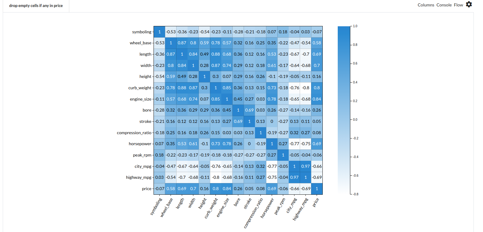
- Drop features independant features which are highy correlated with each other.
- Pick all the columns which are highly correlated with the target feature.
Based on the seen correlation, we choose the following features which can explain our target variable, price.
- engine_size
- curb_weight
- width
- horsepower
Feature Encoding
Take all the categorical columns and encode them based on the value occurance.
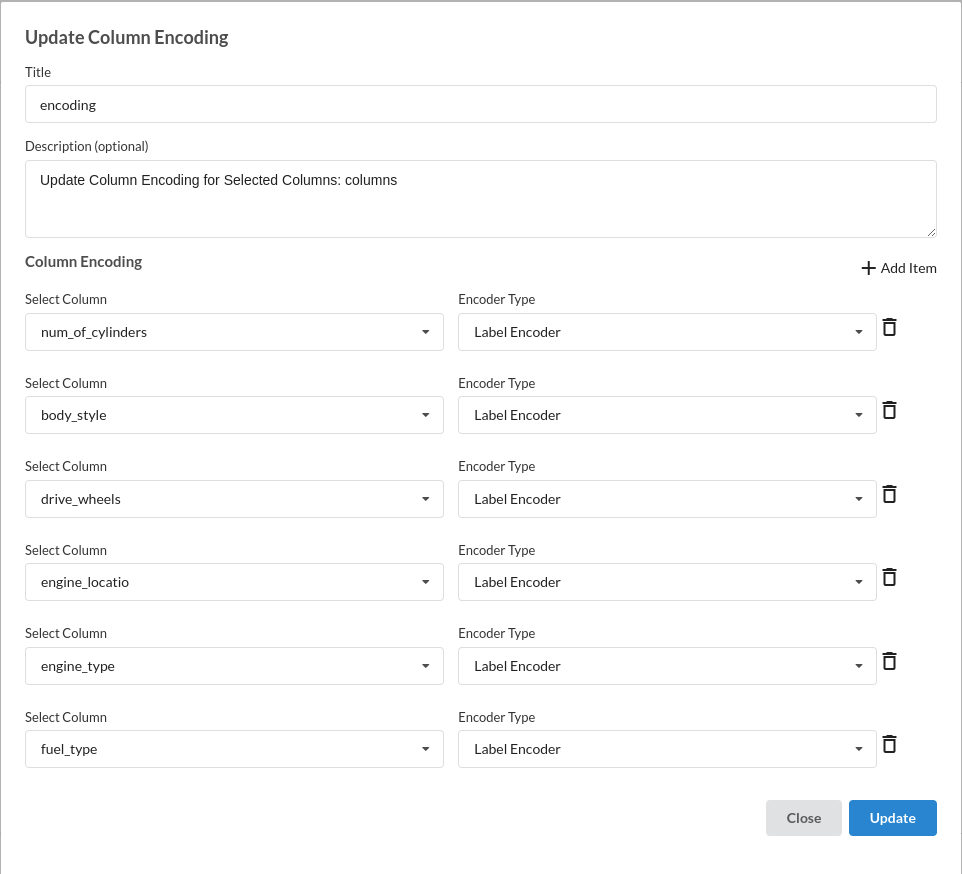
Now Check the correlation again and choose the requred columns that are showing high correlation with our target variable, price.
The processor used for this step is Feature encoding
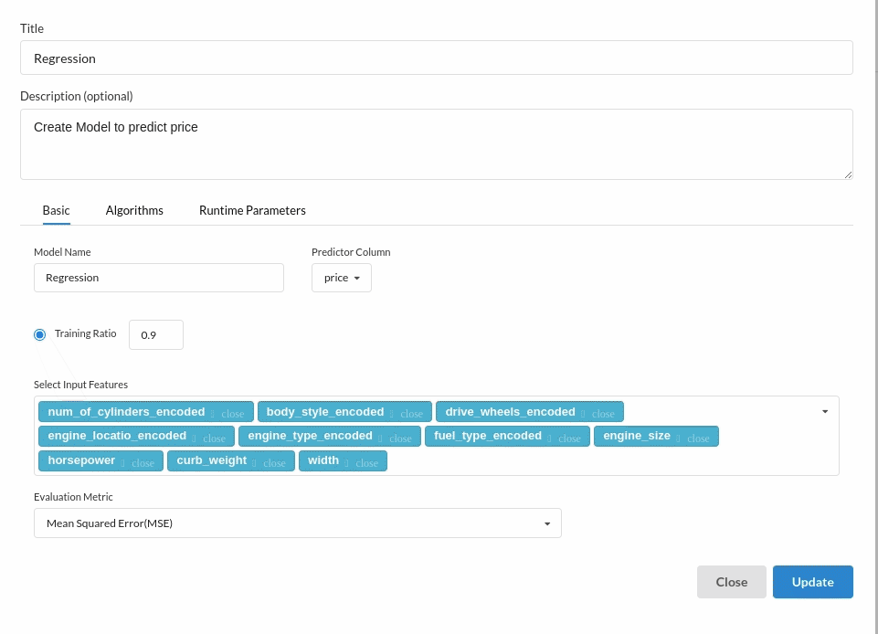
Choose the algorithm and train the model.
Since we are building a price prediction model which is a continuous variable. Choose the Regression(auto pilot) from the Transformer View and fill the required information. For more on model parameters, refer to Regression (autopilot)
Review the model output and Evaluate the model
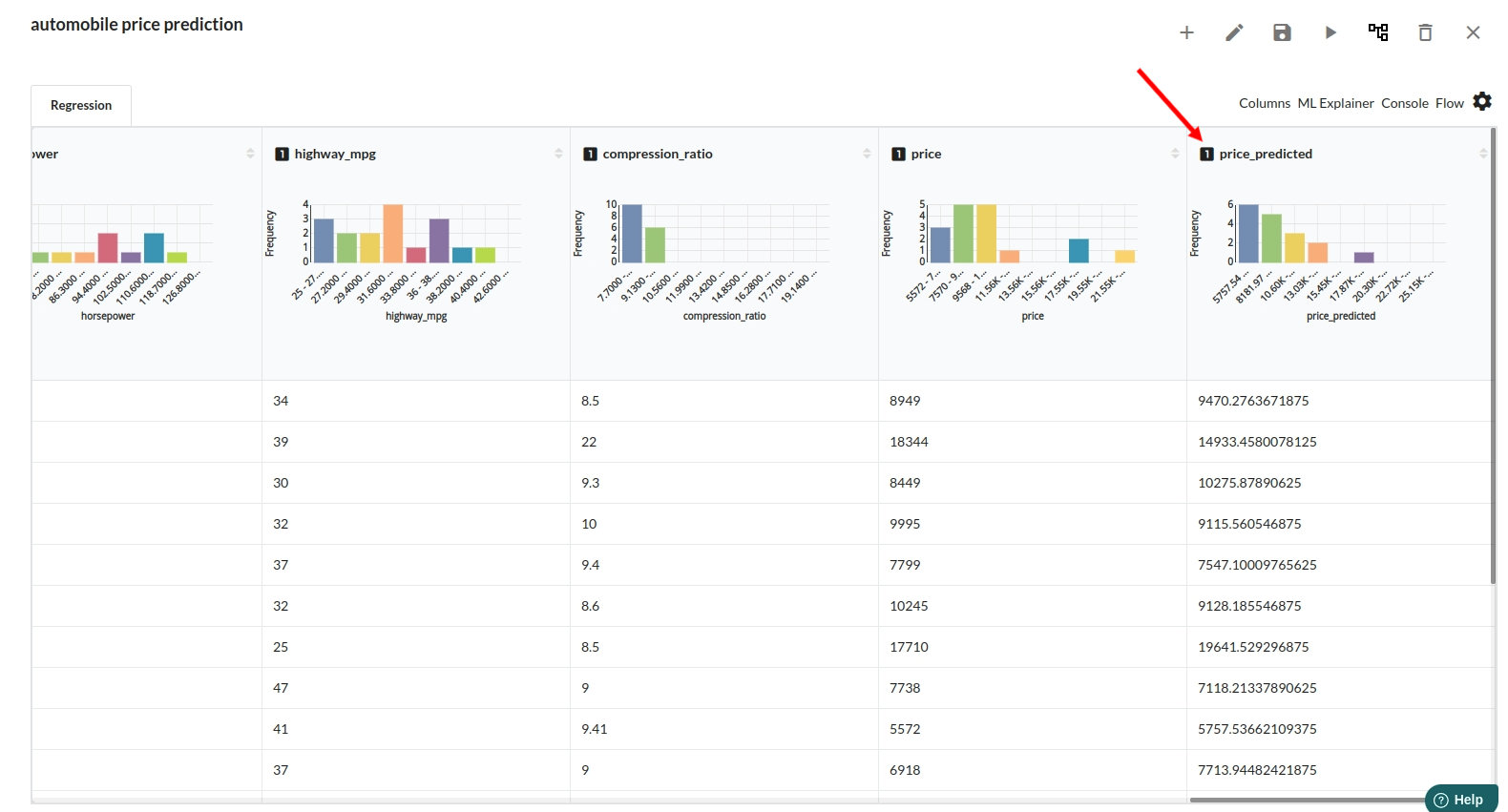
After you finish building the model, it is time to review the model output. Look at the output window to first review your predicted results .Since this is a regression problem you will get a new column in the view like the one below.
When you finish building your model you will see another tab in the view called Ml explainer . Click on that to evaluate your model.
![]()
- The first view you see when you click on ML explainer is the Summary view
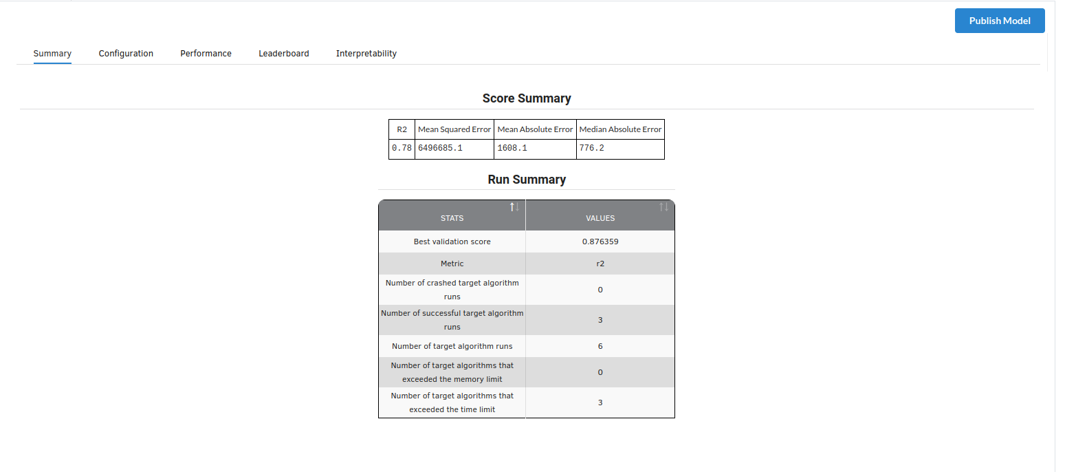
Look at the metrics score and the Run summary stats. Based on your calculations decide if the R2, mean Sqaured Error and Mean Absolute Error are according to your expecation. if not this will be your first step to rethink the training process.
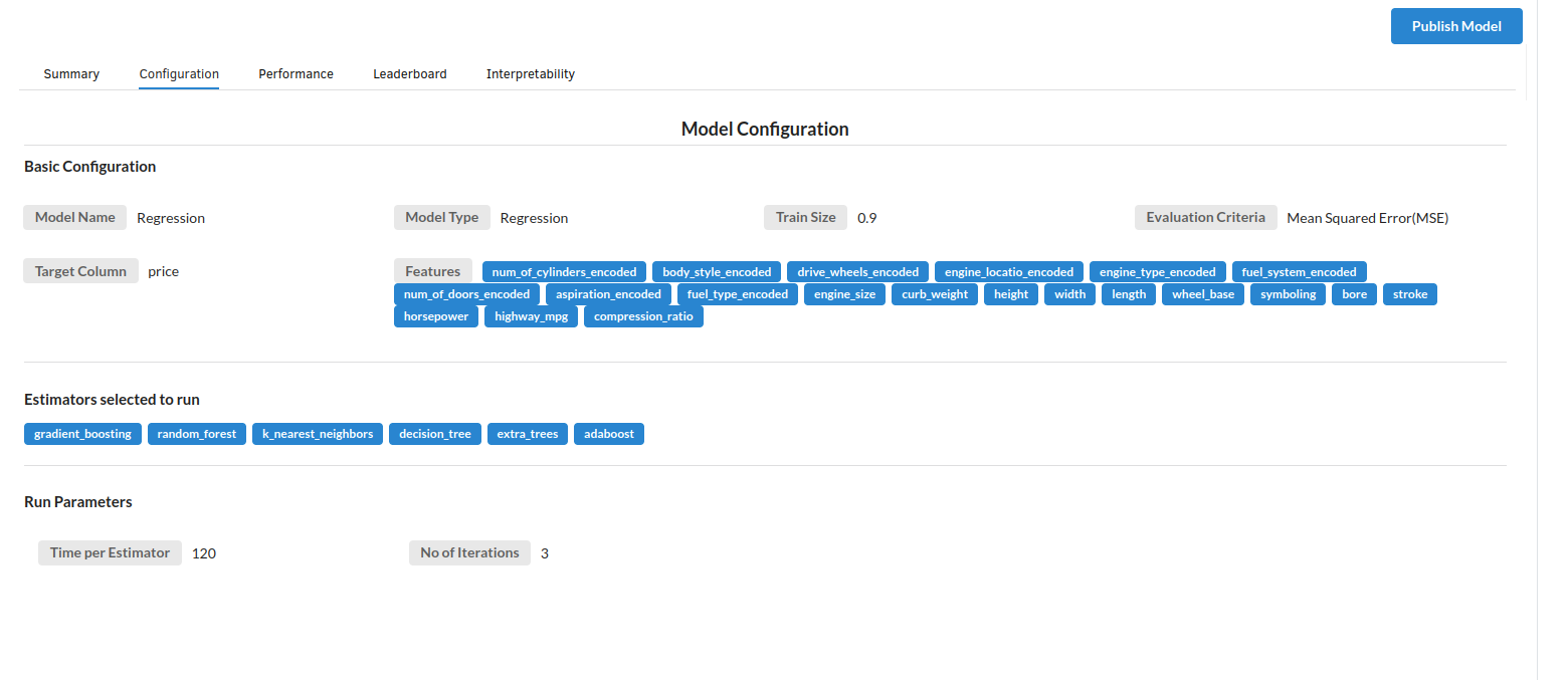
- The second view under Ml explainer is configuration view
The configuration view will give you the information about the step you filled in the Regression step . The view would look like the one below.
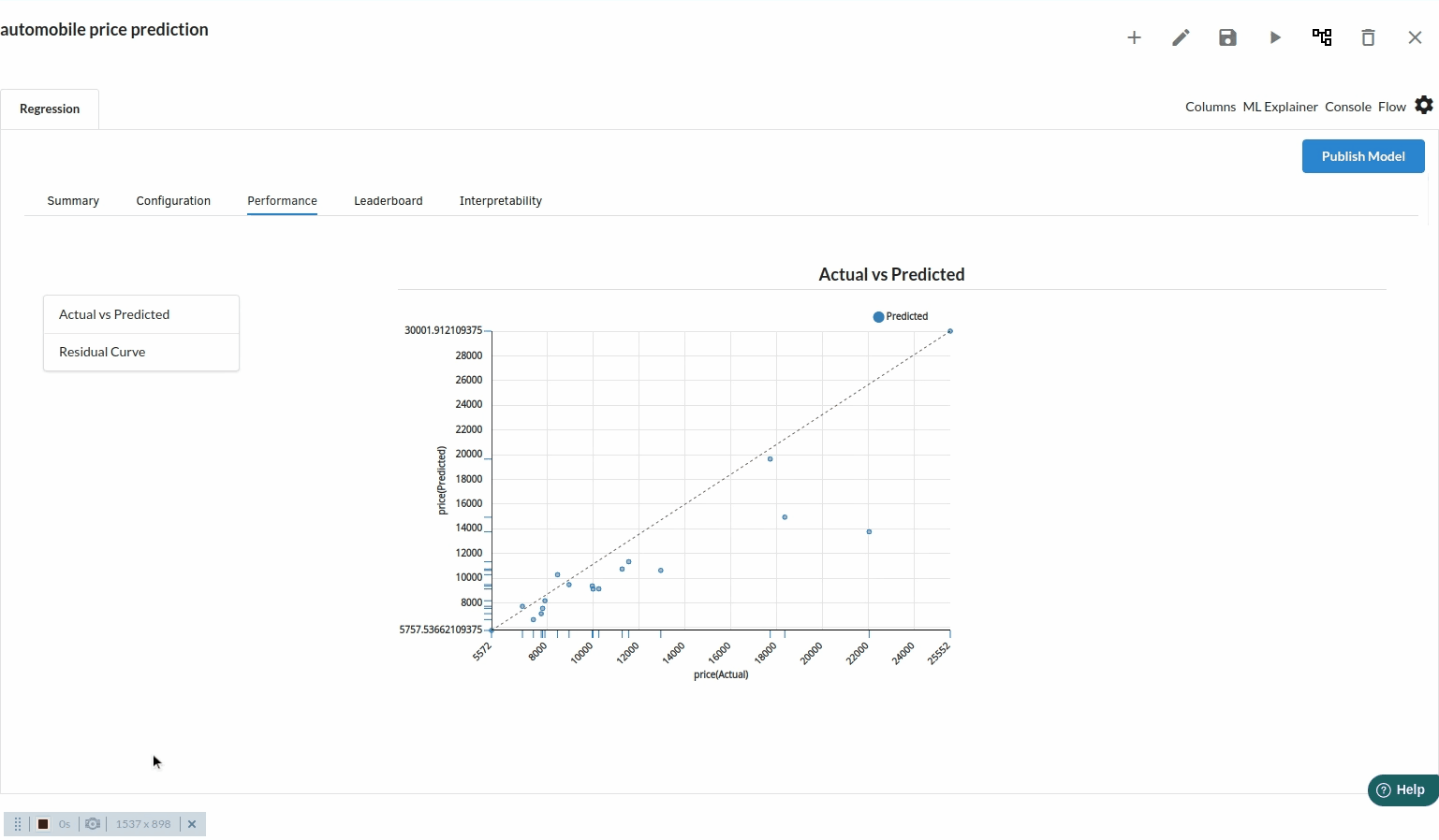
- The third view under Ml explainer is Performance View . You can see the actual vs predicted and the residual curve charts for regression. Look at the built charts and decide if the charts are good enough for your model. The actual vs predicted chart is a good indicator to understand how well your model was trained .
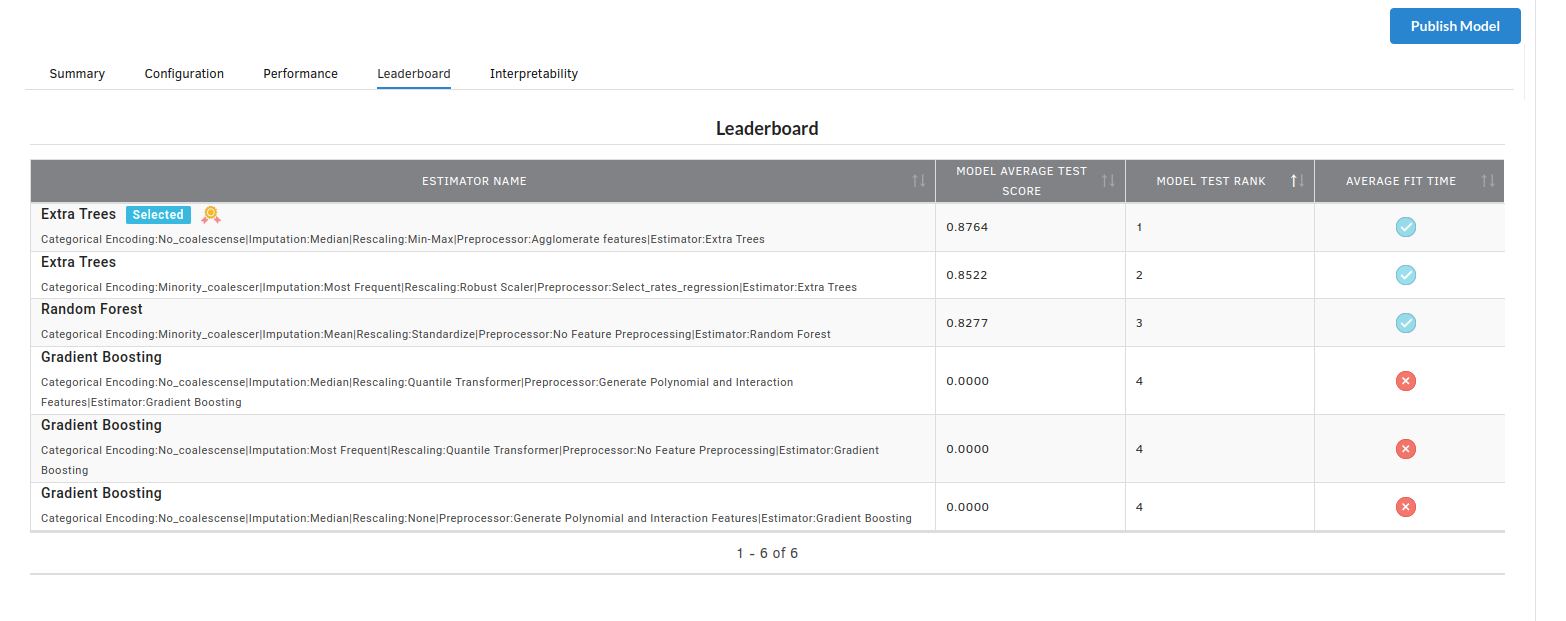
- The fourth view under Ml explainer is Leaderboard . In this view you can see the number of algorithms trained and all the feature engineering done on the algorithms used with ranking system to rank the best algorithm trained.
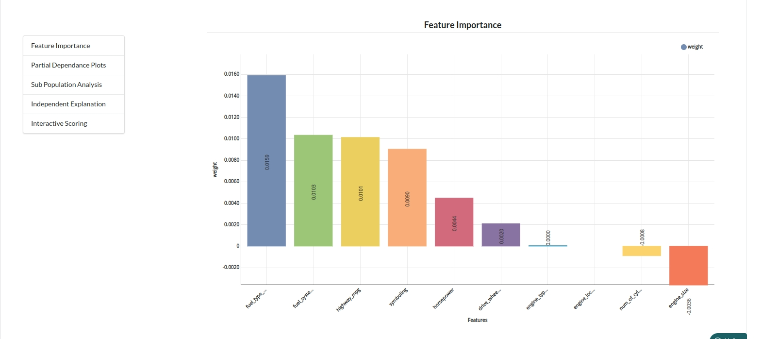
- The last view you see under ML explainer is Interpretability . In this view you will be able to interpret your model in simple terms where you will be getting results pertaining to feature importance , PDP Plots , Sub Population Analysis , Independant Explanation , Interactive Scoring . for more infomation on these results , refer to Interpretability . The Interpretability tab and the results under this tab would look like the one below.
- Feature Importance
- Partial Dependance Plots

- Sub Population Analyis

-
Independant Explanation
-
Interactive Scoring