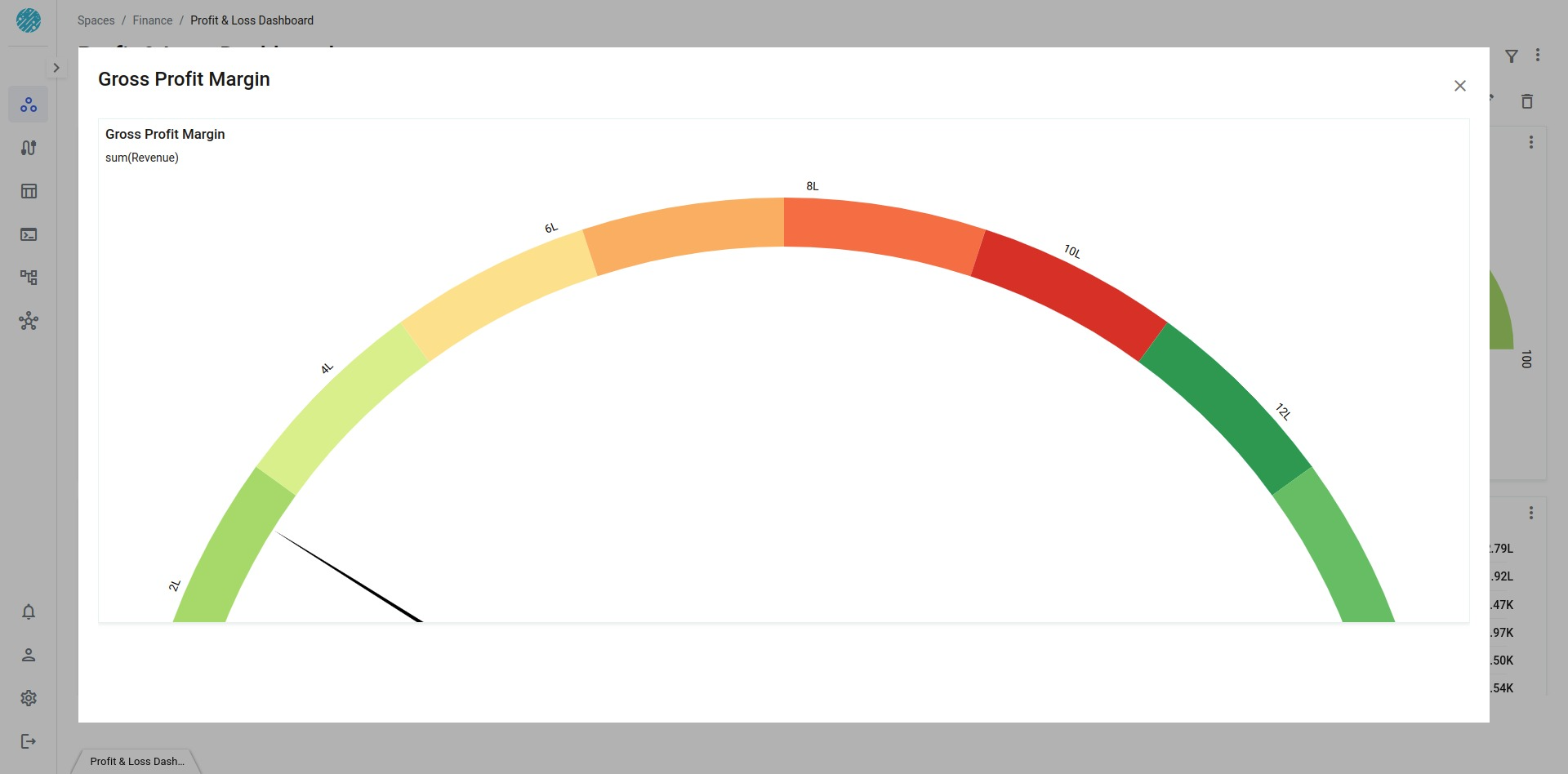
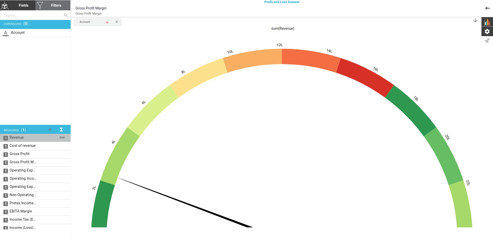
gauge chart
A gauge chart, also known as a dial chart or speedometer chart, is a type of visualization that displays a single value within a range or on a scale. It is often used to represent a metric or a single data point in relation to a target or a predefined range.
Steps
Follow the steps below to create a Stacked Vertical Bar
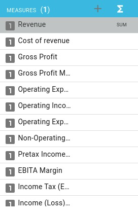
- Choose all the required Measures
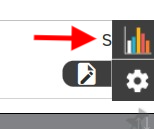
- Click on the chart icon you see on the top right of the page
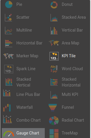
- You will see a pop up which includes all the chart types supported by Xceed. Click on the Multi KPI
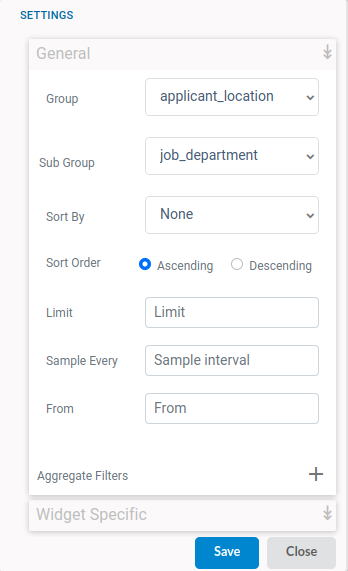
- Choose the type of settings you would like from the General Settings
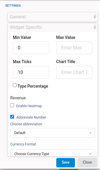
- Choose the type of settings you would like from the Widget Settings
- Click on Save to finish creating the table
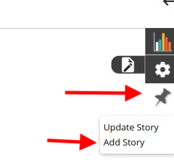
- Click on the Pin icon you see near the chart and settings icon after saving the chart. This will allow your charts to be added in the dashboard.