Introduction to the Charts view
When you Add a new story to your story board , you will get a view like the one below
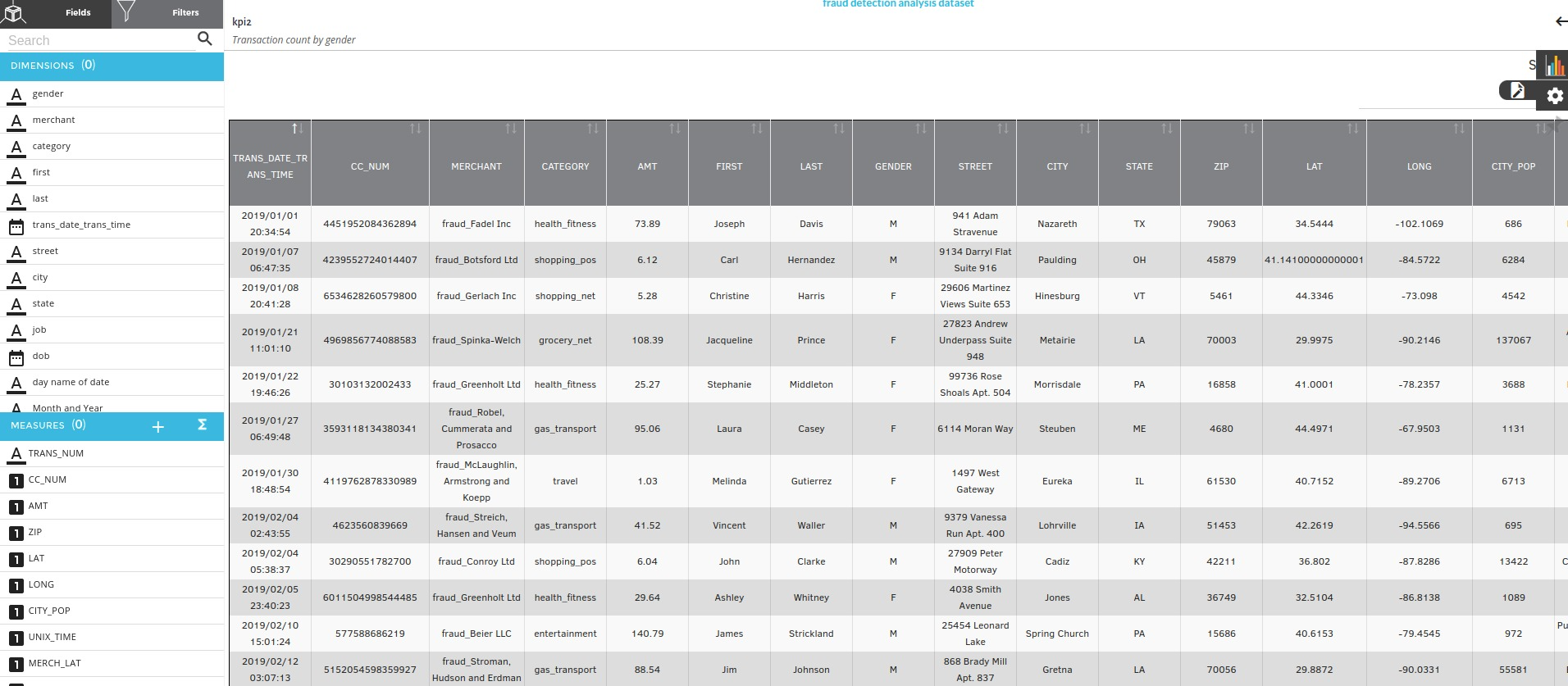
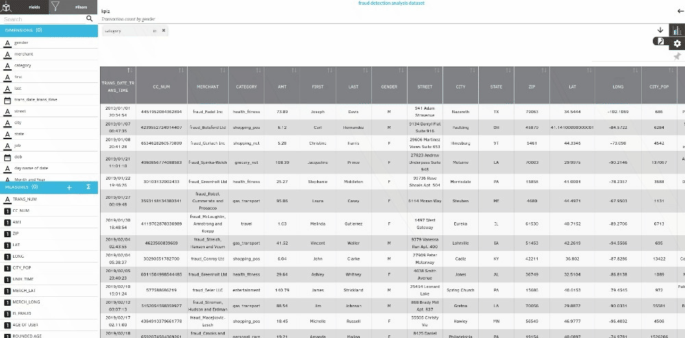
This is the Charts view of the dashboard service.In this view you can create all kinds of visualization from the supported 25 chart types with all kinds of custom aggregation and filterswith it.
The page consists of the following parts :
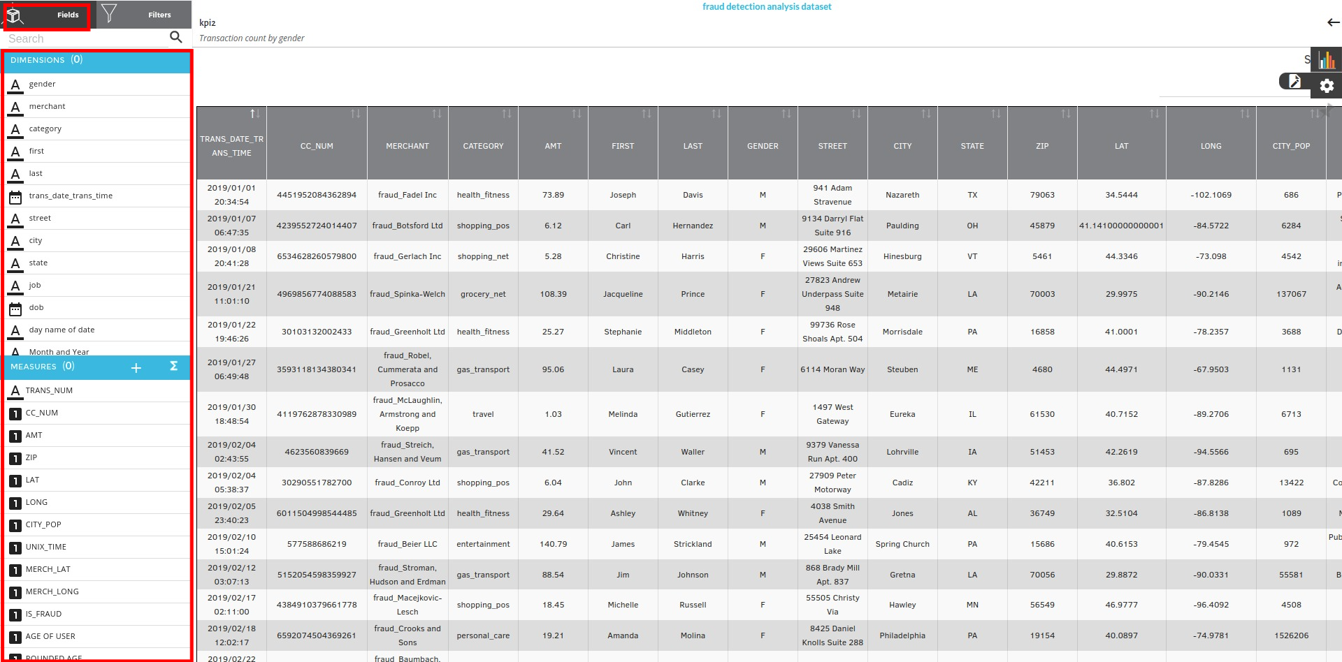
Fields
Fields is a placeholder for all the columns which are divided into dimensions and measures
Filters
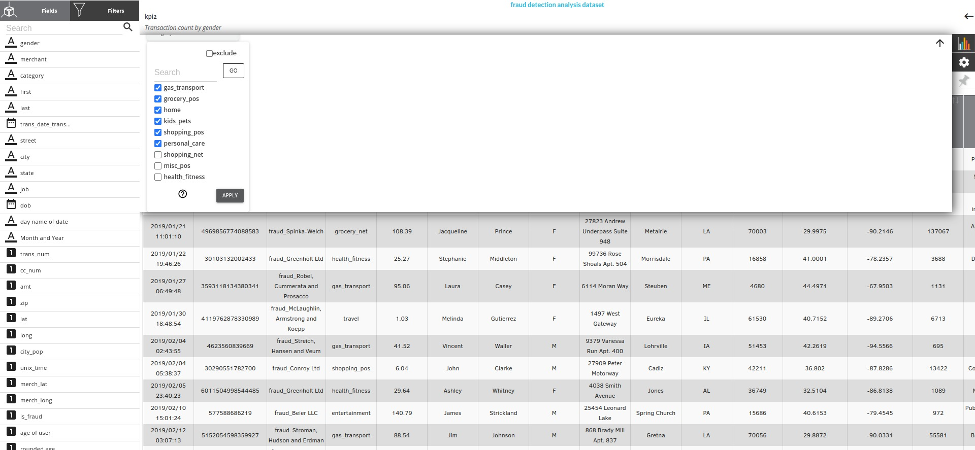
Filters is a view where you can filter out the column values by a simple visual click and select interface. You will be able to select any and all of the values of any column of all data types .
Steps to create a filter
-
Click on the filters icon
-
Choose a column of your choice
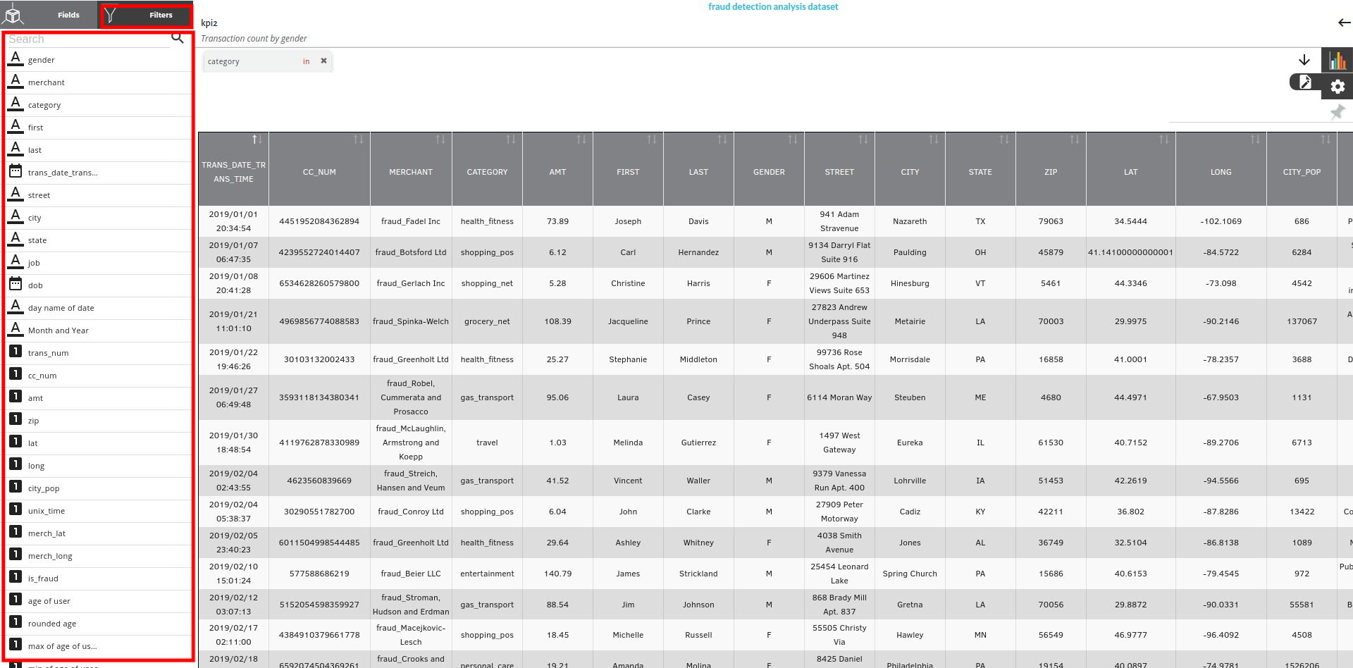
- Click on the Filter icon
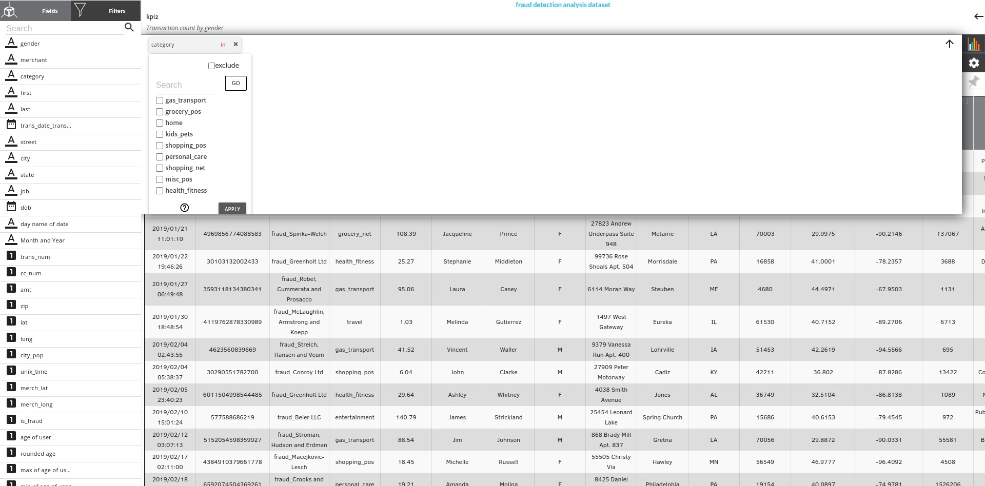
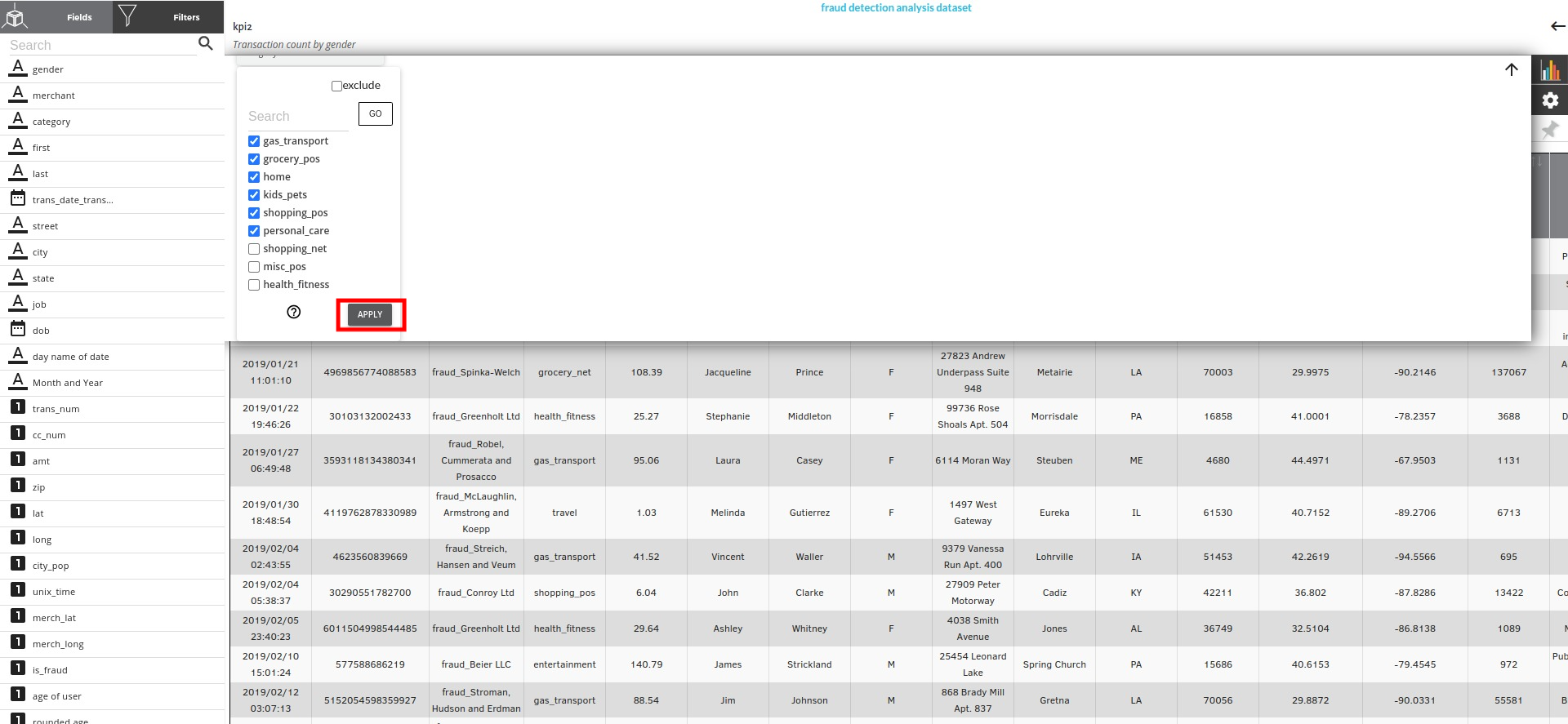
- Choose the value you want to include of exclude. If you want to exclude any value , there is a checkbox on the top.
- Click on Apply after selecting the values.
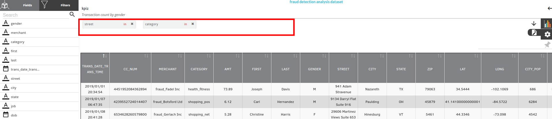
- After applying all the filters, the columns on which the filters were applied will be shown at the top of the charts view.
Dimensions and Measures
A Dimension is a field that can be used to split up another field or measure into distinct groups. It can be used to define the level of detail to perform an aggregation on. For example, we can use the Sum of Sales as a measure and then use Region as a dimension field to split apart the Sum of Sales into the Sum of Sales per Region.
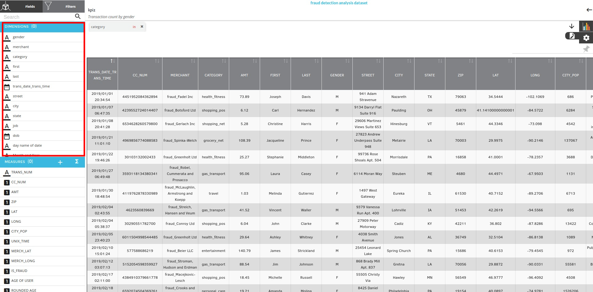
A Measure is a field that can be aggregated in some way, such as a sum or an average. Think of it as something that can be collected, counted, or combined in some way to return a single value.
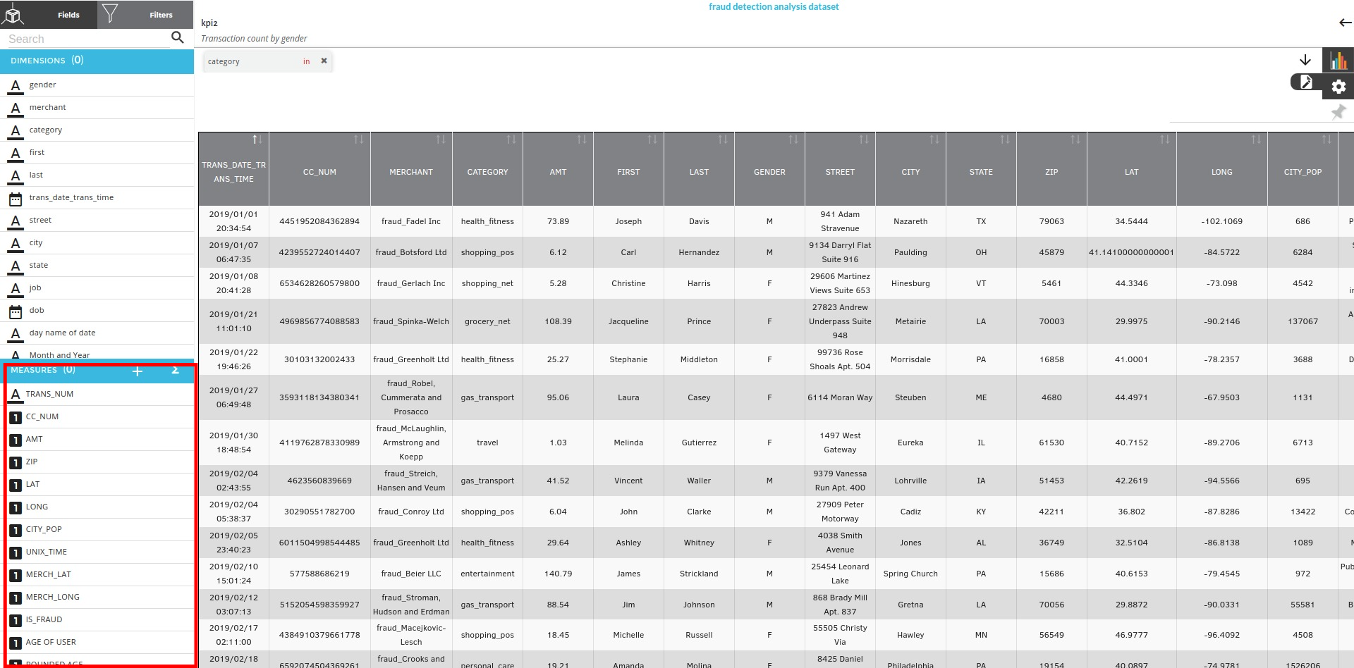
Chart Types and settings
The right part of the page that you see has a block with three icons Namely Chart Types , Settings icon , Charts Pin
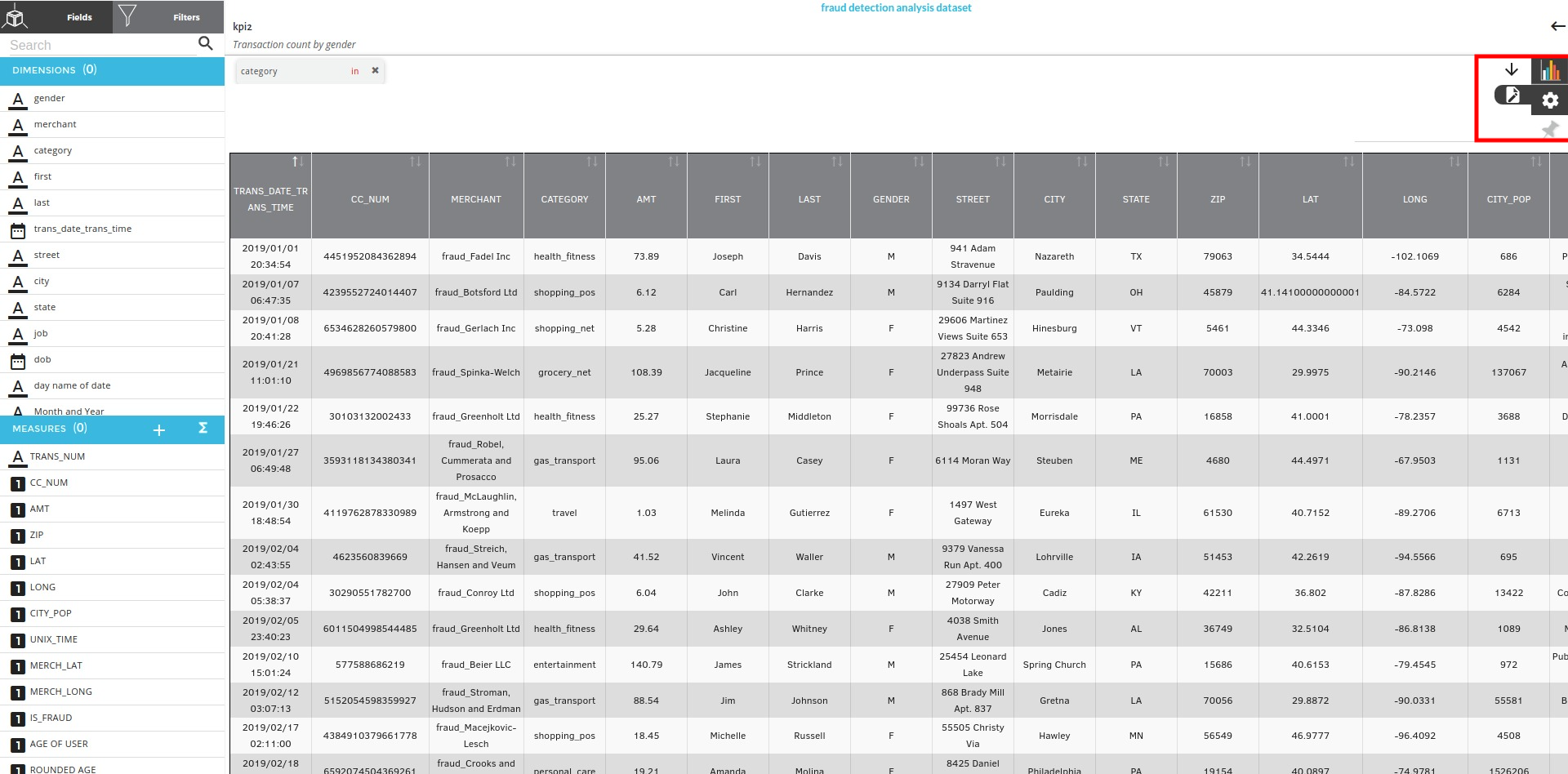
Chart types
Click on the chart icon you see in the block and you will see all the chart types that Xceed supports. for more information, refer to Visualization Types
Based on the selection of dimensions and measures you will see all the chart types being highlighted which indicates that the highlighted charts can be executed
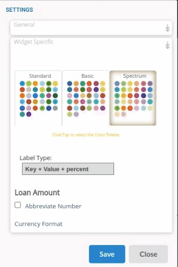
Settings Icon
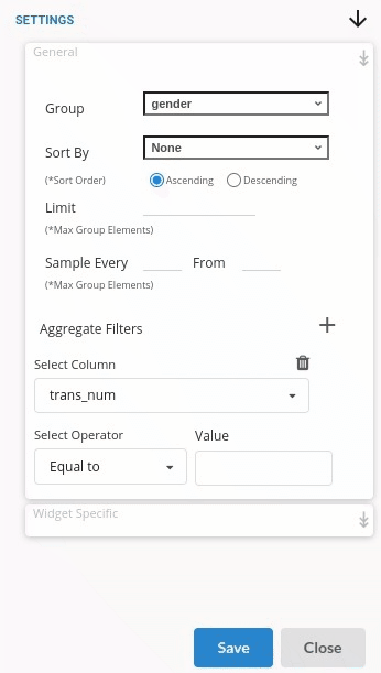
Setings icon is where you can see all the setting related to the charts. There are two types of settings for all the charts :
-
General Settings : General settings of a chart type will include
- Sort option
- Limit elements
- Aggregate filters for selected measures
General settings would look like the one below
- Widget Settings Widget settings are usually based on the Visualization type you select. one of the widget settings for a pie chart would look like the one below
Charts Pin
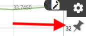
Under the settings icon you will see an icon shaped like a pin. After creating a story of your choice you need to pin it to the Storyboard. There are two options under chart pin .
Click on the Charts pin to get the options .
-
Update Story: Make changes to an existing story and reflect that back in the story board
-
Add Story : after creatinga a new story pin it to the storyboard