Regression Methods

What is Regression analysis?
Regression analysis is a fundamental concept in the field of machine learning. It falls under supervised learning wherein the algorithm is trained with both input features and output labels. It helps in establishing a relationship among the variables by estimating how one variable affects the other.
Imagine you're car shopping and have decided that gas mileage is a deciding factor in your decision to buy. If you wanted to predict the miles per gallon of some promising rides, how would you do it? Well, since you know the different features of the car (weight, horsepower, displacement, etc.) one possible method is regression. By plotting the average MPG of each car given its features you can then use regression techniques to find the relationship of the MPG and the input features. The regression function here could be represented as $Y = f(X)$, where Y would be the MPG and X would be the input features like the weight, displacement, horsepower, etc. The target function is $f$ and this curve helps us predict whether it’s beneficial to buy or not buy. This mechanism is called regression.
Algorithms/Estimators in Regression
If you refer Scikit-learn's documentation you will see that there are 18 estimators created for regression . Now the question is are all of those frequently used in production ? No . Most of it seem like unthinkable jargons for newbies but there are cases where a very complex estimator will be used to create a model
Few of the most important Algorithms/estimators which are used in the industry frequently and have gotten good results are as below :
- Linear Regression
- Ridge Regression
- Lasso Regression
- Decision Tree Regression
- Random Forest Regressor
- KNN
- Support Vector Machine(SVM)
Regression Algorithms in Xceed
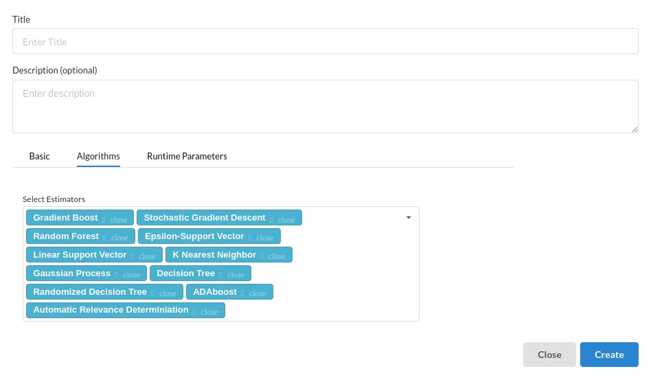
Given the number of estimators that are famously used, Xceed supports a little more than that and can be used effortlessly without any in depth knowledge of the algorithms because the concept remains the same in most of the algorithms
The below picture is a view listing all regression estimators Xceed supports
Evaluating a Regression model
Mean Absolute Error(MAE)
MAE is a very simple metric which calculates the absolute difference between actual and predicted values.
To better understand, let’s take an example you have input data and output data and use Linear Regression, which draws a best-fit line.
Now you have to find the MAE of your model which is basically a mistake made by the model known as an error. Now find the difference between the actual value and predicted value that is an absolute error but we have to find the mean absolute of the complete dataset.
so, sum all the errors and divide them by a total number of observations And this is MAE. And we aim to get a minimum MAE because this is a loss.
Mean Squared Error(MSE)
MSE is a most used and very simple metric with a little bit of change in mean absolute error. Mean squared error states that finding the squared difference between actual and predicted value. So, above we are finding the absolute difference and here we are finding the squared difference. What actually the MSE represents? It represents the squared distance between actual and predicted values. we perform squared to avoid the cancellation of negative terms and it is the benefit of MSE.
Root Mean Squared Error (RMSE)
As RMSE is clear by the name itself, that it is a simple square root of mean squared error.The output value you get is in the same unit as the required output variable which makes interpretation of loss easy.
Explaining a Regression Model
After the model creation and checking all the evaluation criterias you need to come to the explainability/interpretability part of the process where there are two important charts are used all over the data space .
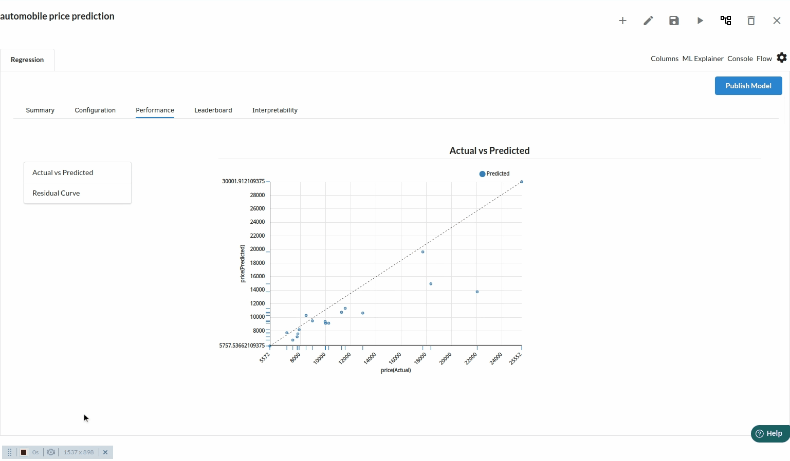
Actual Vs Predicted
Scatter plots of Actual vs Predicted are one of the richest form of data visualization. You can tell pretty much everything from it. Ideally, all your points should be close to a regressed diagonal line. So, if the Actual is 5, your predicted should be reasonably close to 5 to. If the Actual is 30, your predicted should also be reasonably close to 30. So, just draw such a diagonal line within your graph and check out where the points lie. If your model had a high R Square, all the points would be close to this diagonal line. The lower the R Square, the weaker the Goodness of fit of your model, the more foggy or dispersed your points are (away from this diagonal line).
Residual chart
A residual plot is a graph that shows the residuals on the vertical axis and the independent variable on the horizontal axis. If the points in a residual plot are randomly dispersed around the horizontal axis, a linear regression model is appropriate for the data; otherwise, a nonlinear model is more appropriate.
Xceed supports both of these charts for explaining your regression model